今回は複数のフラフを並べて書く方法を勉強します。
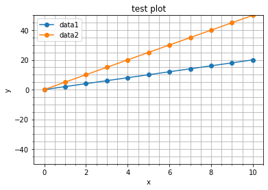
以下のイメージで書くを思えば簡単です。
一枚の紙を “plt.figure” を使って作成します
“subplot” でその紙をn等分(今回は4等分)します。
それぞれの領域に “plot” でグラフを書いていきます。
それでは以下のコードを実行してみましょう。
#numpyとmatplotlibをインポート
import numpy as np
import matplotlib.pyplot as plt

#各データ作成
x = np.linspace(0, 10, 1000)

y1 = np.sin(x)
y2 = np.sin(2*x)
y3 = np.sin(3*x)
y4 = np.sin(4*x)

#ラベル、変数等を作成
c1,c2,c3,c4 = 'red', 'blue', 'green', 'black'
l1,l2,l3,l4 = 'sin(x)', 'sin(2x)', 'sin(3x)', 'sin(4x)'

xl = 'x'
yl = 'y'


#グラフを表示する領域を,figオブジェクトとして作成。
fig = plt.figure(figsize = (12,6), facecolor="lightgray",tight_layout=True)

#グラフを描画するsubplot領域を作成。
ax1 = fig.add_subplot(2, 2, 1)
ax2 = fig.add_subplot(2, 2, 2)
ax3 = fig.add_subplot(2, 2, 3)
ax4 = fig.add_subplot(2, 2, 4)

#各subplot領域にデータをプロット。
ax1.plot(x, y1, color=c1, label=l1)
ax2.plot(x, y2, color=c2, label=l2)
ax3.plot(x, y3, color=c3, label=l3)
ax4.plot(x, y4, color=c4, label=l4)

#各subplotにxラベルを追加。
ax1.set_xlabel(xl)
ax2.set_xlabel(xl)
ax3.set_xlabel(xl)
ax4.set_xlabel(xl)

#各subplotにyラベルを追加。
ax1.set_ylabel(yl)
ax2.set_ylabel(yl)
ax3.set_ylabel(yl)
ax4.set_ylabel(yl)

#各subplotに凡例を表示。
ax1.legend(loc = 'upper right')
ax2.legend(loc = 'upper right')
ax3.legend(loc = 'upper right')
ax4.legend(loc = 'upper right')

plt.show()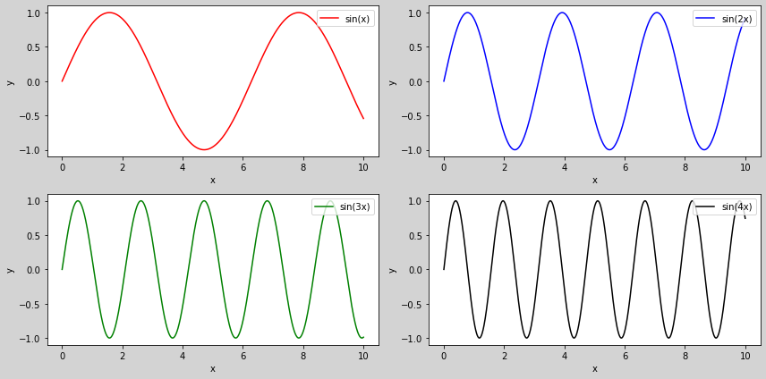
どうでしょうか?描けましたか?
このような方法をオブジェクト指向というようです。それぞれのグラフをオブジェクトとして扱ったというイメージです。オブジェクト指向を学ぶと、大きなプロブラムも簡潔に(わかりやすく)書くことができるようになります。次回はオブジェクト指向について勉強していきたいと思います。